Random Fun Fact of the Day: Machine Learning and Statistics

Every sentient and internet enabled being in the Western world has by now noticed that Amazon’s “customers who bought this item” algorithm is one of the most successful exercises in machine learning. Like various algorithms used by Google, it is oftentimes accurate as well as slightly frightening.

A friend of mine (who is an engineer) told me that he bought an administrator’s guide to Cisco routers. Amazon concluded that he might also be interested in “Cooking for one”. I, on the other hand, recently browsed the excellent Cambridge “Dictionary of Statistics” and also had a look at “All of Statistics” (preposterous title, but an interesting book – incidentally, it tries to convey statistical basics to engineers interested in machine learning). Amazon suggested to round off my order with – drum roll – “Fifty Shades of Grey”. I’m sure my students would agree that there is an intimate link between these three titles.

Data: How many people are shot dead or otherwise killed in OECD countries?

As a follow-up to my recent post on the relationship between gun ownership and gun homicide in OECD countries, I have rolled my dataset (compiled from information published by gunpolicy.org) and my analysis script into a neat Stata package. If you want to recreate the tables and graphs, or otherwise want to play with the…

How many people die each year because of the “Second Amendment”? My estimate is 8000+

Following Friday’s events, the attached image went viral. The figures (if correct) are certainly suggestive, but obviously, the population at risk varies widely between countries. What we need is the gun-related homicide rate for a sample of comparable countries. I headed over to the Brady Campaign, which had created the image, but could not easily…

European Social Survey Multilevel Data

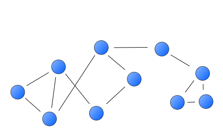
Like social networks, multilevel data structures are everywhere once you start thinking about it. People live in neighbourhoods, neighbourhoods are nested in municipalities, which make up provinces – well, you get the picture. Even if we have no substantive interest in their effects, it often makes sense to control for structures in our data to…

Creating Matrix-Like Plots in Stata

Matrix Graph in Stata

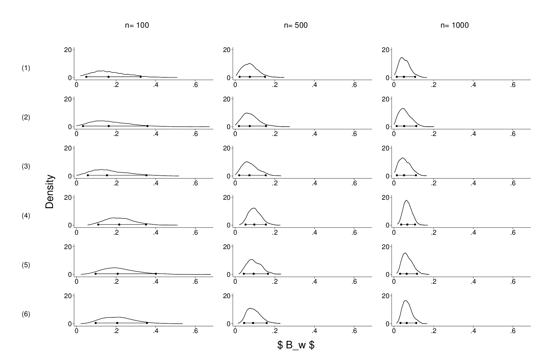
I could find no canned command that produces what I wanted: a table-like arrangement, with labels for the columns (i.e. sample sizes) and rows (experimental conditions). What I could do was set up / label a variable with 18 categories (one for each data set) and use the ,by() option to create a trellis plot. But that would waste a lot of ink/space by replicating redundant information. At the end of the day, I created a nine graphs that were completely empty save for the text that I wanted as row/column labels, which I then combined into two separate figures, that were then combined (using a distorted aspect ratio) with my 18 separate plots. That boils down to a lot of dumb code.

Free historical maps of Germany and Europe

It is mildly embarrassing to come across a great resource that is hosted within one’s own institution by accident (read: google). Unwittingly googling one’s own publications is definitively worse, but that is not the point. Nonetheless, I was happy to stumble upon the Institute of European History’s digital map server when I needed to illustrate my point about territorial cleavages in Germany. The site has a slightly dusty look and uses gifs for previews, but the licence is more than generous and the coverage and quality are impressive. If you ever need a map of Hessen-Kassel’s administrative structures in 1821, look no further. The only thing that is missing (as far as I can tell) are shapefiles, but if you are serious about GIS applications, you can convert/georeference the postscript files. For lecture slides, the gifs should suffice anyway.